|
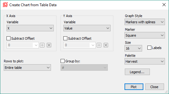
Properties of the Create Chart from Grid
dialog
|
|
X Axis Group
|
|
|
Variable
|
Select the variable to be plotted on the
Horizontal ("X") axis. The names in this box are column headings in
the Grid Control.
|
|
 Subtract Offset Subtract Offset
|
Check this box to subtract an offset value from
the table datum.
|
|
Offset
|
Enter the offset value to be subtracted from the
table datum. Use the drop box to select a prior value saved using
the [+] button.
|
|
Y Axis Group
|
|
|
Variable
|
Select the variable to be plotted on the vertical
("Y") axis. The names in this box are column headings in the Grid
Control.
|
|
 Subtract Offset Subtract Offset
|
Check this box to subtract an offset value from
the table datum.
|
|
Offset
|
Enter the offset value to be subtracted from the
table datum. Use the drop box to select a prior value saved using
the [+] button.
|
|
Rows to Plot
|
Select which rows to include in the chart:
Entire Table:
Selects all rows of the table.
Selected Rows:
Selects only the marked rows.
Note: If the table does not allow individual rows
to be selected, this setting reverts to using the entire table.
|
|
 Group by Group by
|
Check this box to group the table data using the
values in a specified column. The column is selected from the drop
box which lists all of the column headings in the Grid Control.
|
|
Graph Style
|
Selects the type of graph to be created:
Markers: Creates a
scatter plot using markers.
Markers with Lines:
Creates a scatter plot using markers connected by lines.
Markers with
Splines: Creates a scatter plot using markers connected by
splines.
Bars: Creates a bar
plot.
Area: Creates an
area plot.
Area with Splines:
Creates an area plot with values connected by splines.
|
|
Marker
|
Select the marker type from selections in the drop
box.
|
|
Size
|
Select the marker size from selections in the drop
box.
|
|
 Labels Labels
|
Check this box to show Y-Value labels for each
point.
|
|
Palette
|
Select the point, line, and area color scheme from
selections in the drop box.
|
|
Legend
|
Click this button to open the
Chart Legend Properties dialog.
|
|
Plot
|
Creates the plot in a
Chart Window using the selected properties.
|
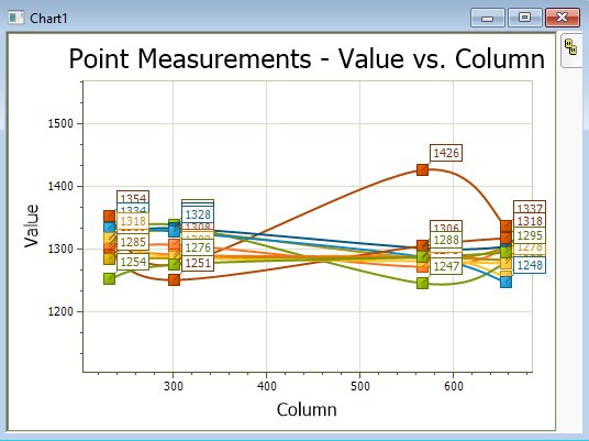
The chart shown below plots the pixel value
("Value") versus column number ("Column") for 4 points measured in
several images of an
Image Set. Here, the points have been labeled using
their Y Axis value, which is the grid column labeled "Value".
Mira Pro x64 User's Guide, Copyright Ⓒ 2023 Mirametrics, Inc. All
Rights Reserved.


