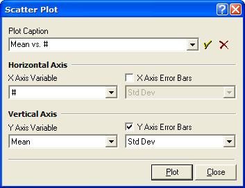
Scatter Plot
The Scatter Plot command graphs the data from two columns in a Report Window. The command also can add x error bars, y error bars, or both.
This command opens the Scatter Plot dialog where you select the columns to graph. The selection of the which rows of data to use is done in the Report Window before this command is used; see Making a Scatter Plot of Report Data.
Open the Scatter Plot command dialog from the View pull-down menu for Report Windows or using the Report Context Menu (right-click inside the Report Window).
The columns listed in the 4 selection boxes dialog are taken from the top-most Report Window. This is the window from which you opened the Scatter Plot dialog.
Error bars are plotted only if their enabling check-boxes are checked; if not checked, the particular columns selected in the error list boxes are ignored.
The Caption specifies the title to be drawn immediately above the plot box. This uses a history control to provide access to captions you may have used in the past.
Report windows have 2 modes for selecting which rows to plot:
All rows are used if no specific rows are selected.
Only selected rows are used if selected in Row Selection Mode. See Selecting Cells in a Report Table and Report Context Menu.
Using option 1, to plot all rows allows you to make a quick graph of all measurements.
Using option 2, to plot only selected rows, allows you to choose exactly which data are included in the graph. In both modes, the data columns are selected using the Scatter Plot dialog.
This example shows how to make a scatter plot of
image statistics having error bars. This
plot was made from a single image by moving the image
cursor to several new positions and clicking ![]() to add new statistics to the table.
Before the first measurement, the table was cleared using the
View > Clear command in the pull-down menu for
theReport Window. After 10 such measurements,
the Statistics report looked like this:
to add new statistics to the table.
Before the first measurement, the table was cleared using the
View > Clear command in the pull-down menu for
theReport Window. After 10 such measurements,
the Statistics report looked like this:
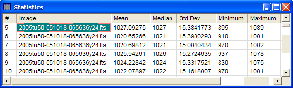
The table was in Single Selection Mode (set in the Report Context menu) so that all rows would be plotted. Next, the Scatter Plot dialog was opened by right clicking on the table.

In this dialog, the # column (sequential measurement number) was selected for the horizontal axis variable and Mean column (mean value) was selected for the vertical axis variable. After checking the Y Axis Error Bars option, the Std Dev column (standard deviation) was selected for the error bars. This produced the following plot showing the Mean value and its variation for each image location:
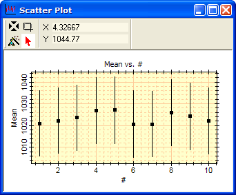
As can be seen, this image is very well-behaved, in a statistical sense, with the mean values measured all around the image lying well within the range of their 1-sigma error bars.
Another very quick exercise is to open a series of images as an image set, then make a single statistics measurement at one location of the Image Cursor. This looks like the following:
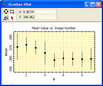
As this plot shows, the mean value at the same location in the different images exhibits some differences tat are unlikely to be random variations.
Selecting Cells in a Report Table, Making a Scatter Plot of Report Data, Plot Windows, Working with Plots