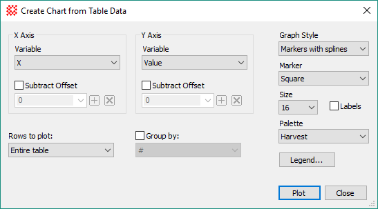
Create Chart from Table Data
The Create Chart from Table Data command creates a Chart Window scatter plot from data in two columns of a Measurement Pane or Report Window. The chart axis names are taken from the column headings of the Grid Control. This command also can add labels, a legend, and other attributes at plot creation time. These attributes can be modified afterwards using Chart Command Menu options such as the Chart Properties Pane. Also see the related Create Plot from Table Data command.
Open the Create Chart from Table Data command dialog from the View menu for Report Windows or use the Grid Command Menu (open the menu by right-clicking inside the Grid Control of theReport Window).
|
Properties of the Create Chart from Table Data dialog |
|
|
X Axis Group |
|
|
Variable |
Select the variable to be plotted on the Horizontal ("X") axis. The names in this box are column headings in the Grid Control. |
|
|
Check this box to subtract an offset value from the table datum. |
|
Offset |
Enter the offset value to be subtracted from the table datum. Use the drop box to select a prior value saved using the [+] button. |
|
Y Axis Group |
|
|
Variable |
Select the variable to be plotted on the vertical ("Y") axis. The names in this box are column headings in the Grid Control. |
|
|
Check this box to subtract an offset value from the table datum. |
|
Offset |
Enter the offset value to be subtracted from the table datum. Use the drop box to select a prior value saved using the [+] button. |
|
Rows to Plot |
Select which rows to include in the chart: Entire Table: Selects all rows of the table. Selected Rows: Selects only the marked rows. Note: If the table does not allow individual rows to be selected, this setting reverts to using the entire table. |
|
|
Check this box to group the table data using the values in a specified column. The column is selected from the drop box which lists all of the column headings in the Grid Control. |
|
Graph Style |
Selects the type of graph to be created: Markers: Creates a scatter plot using markers. Markers with Lines: Creates a scatter plot using markers connected by lines. Markers with Splines: Creates a scatter plot using markers connected by splines. Bars: Creates a bar plot. Area: Creates an area plot. Area with Splines: Creates an area plot with values connected by splines. |
|
Marker |
Select the marker type from selections in the drop box. |
|
Size |
Select the marker size from selections in the drop box. |
|
|
Check this box to show Y-Value labels for each point. |
|
Palette |
Select the point, line, and area color scheme from selections in the drop box. |
|
Legend |
Click this button to open the Chart Legend Properties dialog. |
|
Plot |
Creates the plot in a Chart Window using the selected properties. |
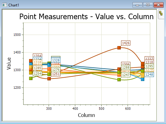
The chart shown below plots the pixel value ("Value") versus column number ("Column") for 4 points measured in several images of an Image Set. Here, the points have been labeled using their Y Axis value, which is the grid column labeled "Value".
Plotting Commands, Chart Windows, Chart Properties Pane, Chart Legend Properties, Create Plot from Table Data, Grid Controls